Logos
Antojo Baked Goods
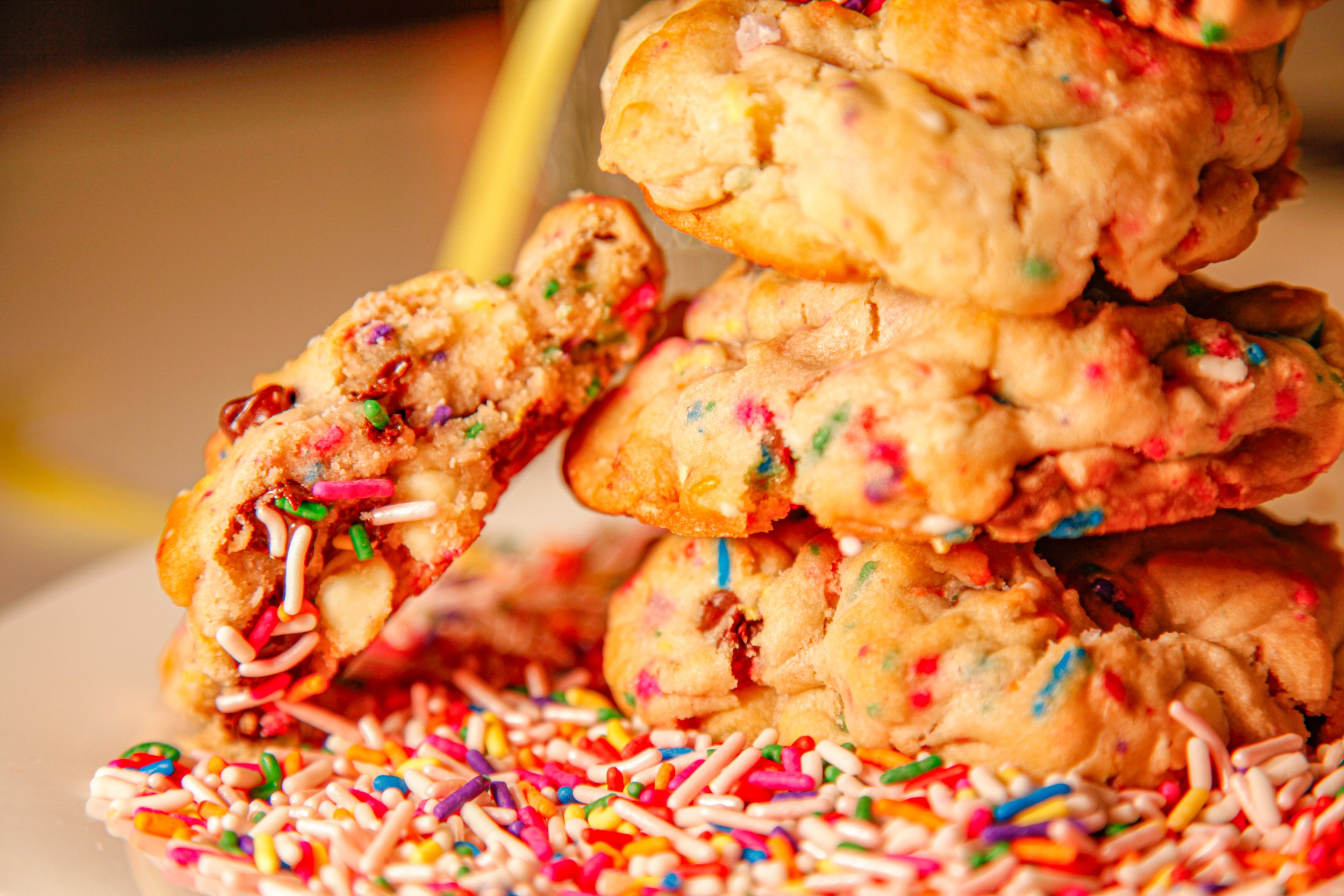
Antojo is my baking company, inspired by the Spanish word for "craving." I created it as a way to share my love for baking with others, turning simple ingredients into treats that bring people joy. Baking has always been a personal outlet, a way to express creativity and connect with others. Starting Antojo allowed me to take that passion to the next level—crafting custom recipes, designing thoughtful packaging, and building a brand that’s all about satisfying cravings with something homemade and heartfelt. It’s more than a business; it’s a way to spread happiness, one treat at a time.
The photos shown represent the beginning of this journey, capturing my initial ideas and early sketches as I refined each element to embody Antojo’s spirit. In the bottom left corner, you'll find the final design—a piece that brings together the warmth of a craving fulfilled and the joy of sharing something deliciously homemade.


Neon Earth Kitchen
Working on the Neon Earth Kitchen logo and iconography was an exciting opportunity to bring the restaurant's mission to life visually. I collaborated closely with my partner to create a logo that wasn’t just eye-catching but also conveyed what makes Neon Earth Kitchen unique: a commitment to offering gluten-free, sugar-free, and lactose-free options that are as delicious as they are wholesome. We focused on designs that would instantly communicate the restaurant’s clean and health-conscious approach while still feeling inviting and vibrant. From the logo’s colors to the icons representing each dietary benefit, every detail was crafted to reflect Neon Earth Kitchen's dedication to providing flavorful, mindful meals that people could trust and enjoy.


